BrainVoyager v23.0
Data FlowVisualization
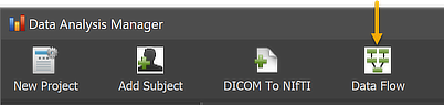
When defining and connecting multiple workflows to build more complex pipelines, the established data flow can be visualized at any moment using the Data Flow Visualization window, which can be invoked by clicking the Data Flow icon in the main toolbar of the Data Analysis Manager (see figure below).
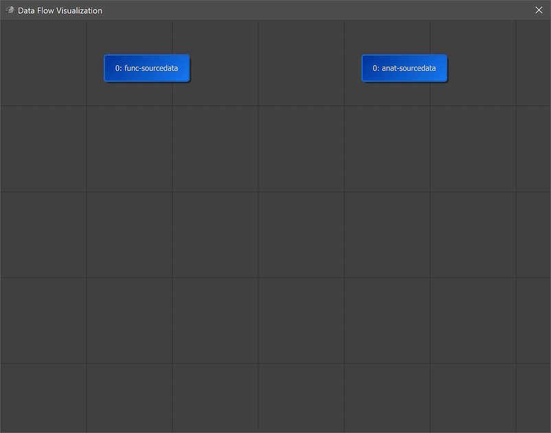
Before defining any workflow, the window will only show two nodes representing the NIfTI source data for anatomical and functional datasets (see below).
After defining and connecting all currently available workflows, the data flow graph will look similar as the one below. The text in each node identifies a workflow by its unique ID ('0' is used for source NIfTI data) and a workflow name that describes the operation of the respective workflow. The workflow names may be different than shown below since the names provided as default can be changed by the user in the Workflow dialog.
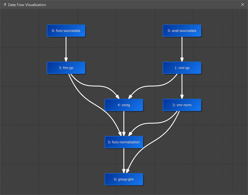
Connected nodes are ordered from top to bottom depending on their input nodes as well as whether they process anatomical, functional or both types of data. Non-connected nodes are placed on the left side. The displayed layout can be, changed, however, by dragging nodes to other positions. For a future release it is planned that workflows and their connections can be specified in this window in addition to the Create Workflows and Connect Workflows dialogs that must be used in the present version of the program.
Copyright © 2023 Rainer Goebel. All rights reserved.